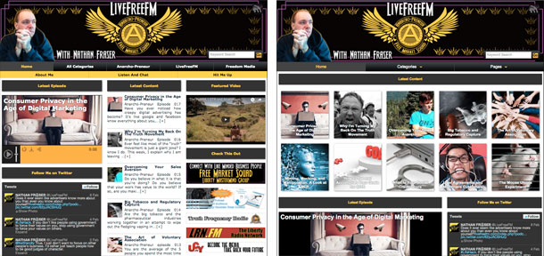
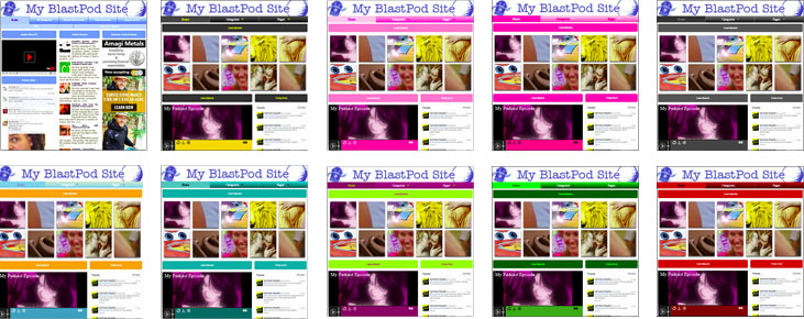
Every BlastPod account comes with two free templates, and 10 free color schemes. This allows you to customize the look and feel of your podcast website. By default, your website will be set to the Clear Blue color scheme, and the Classic template. Customizing your podcast website is quick and easy, and only takes a couple of seconds.
Let’s go back to the Site Configuration page, and click on the Site Template field, just right of the site preview image. If you have purchased other templates, they will appear in the drop-down menu. If not, you will be able to choose between “Classic”, and “New Style”.
Classic is built to resemble a classic blog layout, with the most recent posts listed down the middle column. This option gives your site a more traditional media website feel, and is best for informational style podcasts.
New Style is built to look a little more edgy. The post preview images appear larger and at the top of the front page, rather than listed down the center. This layout is better suited for entertainment themed podcasts.

After you have posted a couple of episodes, you may want to play around with this option and see what you prefer for your website. Additional templates will also be available for purchase in the BlastPod Store.
Next, you’ll want to pick your color scheme. You get access to 10 free color schemes, with more available in the BlastPod Store. Color schemes allow you to change the button colors, page title colors, and widget title colors. If you have a logo or brand color, pick the color scheme that best matches it. If not, choose a color scheme that feels like the best match for your podcast. Your podcast player, search bar, and mobile hamburger menu will also change colors, based upon what color scheme you pick.

Now that you’ve chosen your layout and color scheme, you’re almost done. It’s time to add some custom header art, and really make it a site of your own.


