
With all the podcast on iTunes, standing out can be difficult.
Often, the cover image of your podcast will be the deciding factor on whether or not someone gives it a listen. As they're scrolling through, your podcast cover art needs to grab their attention and pull them in.
How do you do this? By following the steps laid out below.
What Size Should My Cover Art Be?
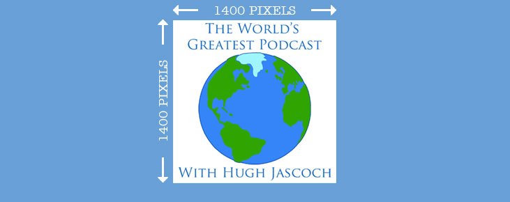
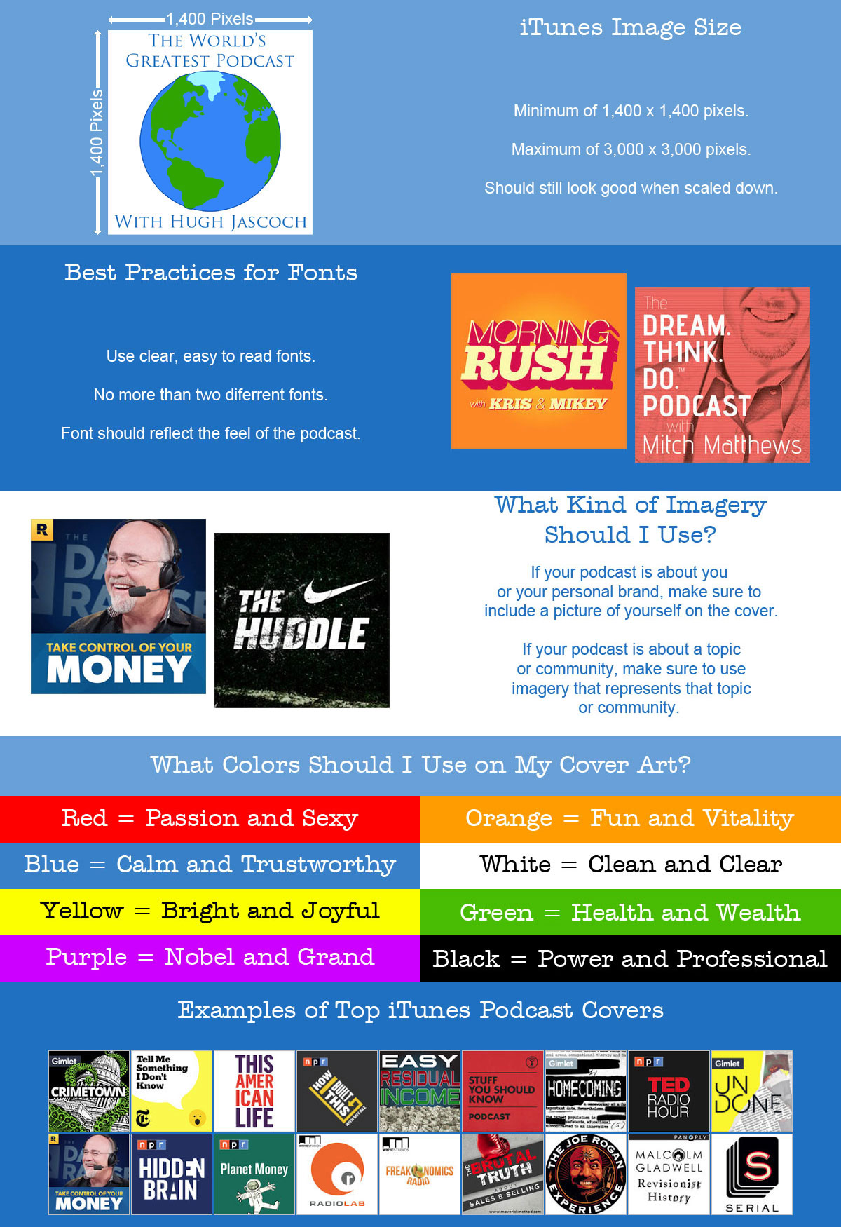
Your iTunes podcast art needs to be at least 1,400 pixels wide by 1,400 tall. This is the smallest size iTunes will accept. The largest they will accept is 3,000 by 3,000. So keep your art somewhere in between those two numbers.
Your cover art must also be an exact square. This means that pixel height and width have to be the exact same.
Also, iTunes is picky about the quality of what they accept. Try to avoid artwork that is too "busy". You want it to be easily recognizable, even when the listener can only see a thumbnail. So keep it clean and simple.
What Kind of Fonts Should I Use?
Most people will be viewing your cover art from their mobile devices. That means if the title of your podcast not in an easy-to-read font, they might skip right past you. So make sure your podcast title is in a clear font that's easy to read.
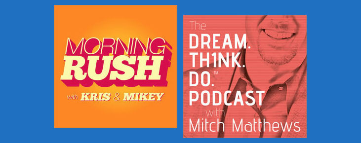
Another thing to keep in mind is a number of fonts used on the cover. A good rule of thumb is to never use more than two fonts on one piece of art. This goes for web pages, restaurant menus, and it also applies to iTunes cover art.
One last thing to remember about fonts is you want them to reflect the "feel" of the show. If the show is serious and professional, use straight lined fonts. If the show is loose and fun, use a font that reflects that feel. Generally, straight lines are more masculine and serious, while curvy lines are more feminine and fun.
What Kind of Images Should I Use?
A big hang up that most podcasters run into is what type of imagery should be on their cover art. Should I use a picture of myself? An icon or logo? A photo of a nice sunset? The choices are limitless.
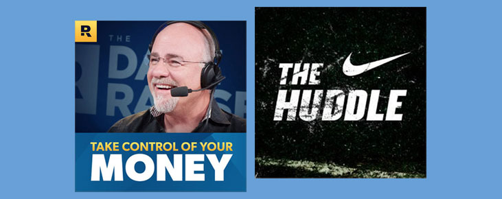
Here's what I say, If the podcast is about your personal brand, then use a picture of yourself on the cover. Make sure it's a current picture. And it's probably best to get something professionally done.
If your podcast is about a certain topic or community, use imagery that represents that topic or community. Make sure it's something that will grab their attention and they'll instantly recognize. Just beware of using copyrighted material. Fair use laws might be something you look into before hitting Publish.
What Colors Should I Use?
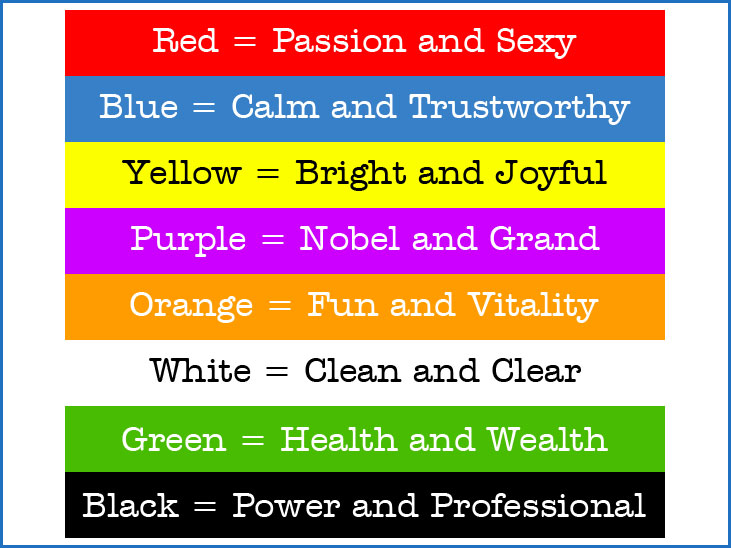
Color is also a big factor in giving your podcast some visual appeal. Different colors can evoke a wide range of feelings in your listener. As a graphic designer, color plays a key role in everything I create.
Color, like font style, should not be overdone. Be deliberate about what colors you use, and which you avoid. and keep this in mind, colors mean different things to different cultures. The meanings I give here are Western-centric.
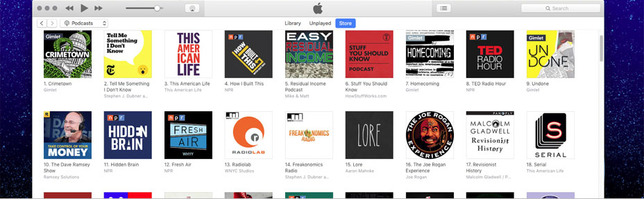
Some Examples of iTunes Cover Art
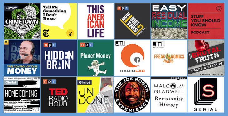
Listed above are some of the top podcasts on iTunes. Pay attention to how they use colors, images, and fonts to convey what the podcast is about, before you even listen.
If you need help with getting your podcast cover put together, there are a lot of great resources out there.
You can start with Fivver. They have a lot of artists there who will work with you at a very affordable price. If your willing to spend a little money, 99 Designs is a great place to look, as well.
But if you have some basic art skills and access to photoshop or some other paint program, you can do it yourself. The tips in this guide will ensure your cover art is great and will get you featured on itunes.
Download yourIt's free, and you don't even have to give me your email to get it.


